
The brief I chose for my A2 Media Advanced Portfolio was 'to produce a Promotion Package for the release of an album, to include a music promo video, together with, a cover for its release on CD/DVD (digi-pack), a Magazine Advertisement for the release of the singe.
Before starting the project I had the option to work as a group but I decided to work alone as I thought I would work quicker and more efficiently on my own. Also I spent a lot of time outside college on my project therefore thought it would have been harder to work in a group as I would have been relying on someone else, and I have had bad experiences with people in the past with group work. But I do partly regret working on my own as at times it was difficult having to be the director, film the footage and make all the decisions.
The project required me to acquire new skills and develop previous skills. For example, the use of editing suite, I had familiarised myself with it in my first year but developed this skill in my second year. Also shooting for the music video was a more recent skill development, as I used a variety of shots.
In order to answer my brief I conducted research into a range of existing materials from different genres from the past and present to help me gain a better understanding of what the conventions of a music video actually are. After watching the videos on YouTube and linking them to my blog, and analysing them, I discovered that each genre followed its own set of rules, which are the conventions. These allow the audience to identify the genre of the music.
Looking into the History of the music video it gave me a clear understanding of what is expected from a music video and due to digitalization and the technology of today I have a better understanding of how digitalization has affected the music video. If we look at website such as YouTube and MySpace which primarily focus on videos of the public, including music videos of small time bands as well as label bands. This is a form of instant distribution worldwide and a free way to promote themselves.
In what ways does your media product use, develop or challenge forms and conventions of real media products?
The media mediate reality through codes and conventions which are in place to let the audience identify what is being portrayed. There are three different types of codes: technical codes, which include camera techniques, framing, , lighting and juxtaposition. Symbolic codes, which include setting, body language, clothing and colour. And thirdly, written codes in the form of headlines, captions, speech bubbles and language style. Along with these, all types of media have different conventions which give the work meaning. For example I used a red rose as a symbol for love. Any other flower wouldn’t have had the same effect, so it had to be this red rose which has been a code to symbolise love for hundreds of years, and this same thought pattern applies to everything. This is because conventions are not natural but are cultural, they have cultural specificities and are now universal. The conventions that the media uses have a history - they come from somewhere and they are responsive to historical forces.
I believe that my Media Texts use conventions of the specific medium chosen. By researching other texts, looking at the standard conventions of the music video and I had a strong ideology of what was needed to be produced and how I would build and structure the texts. From my research I discovered that it is vital to show the musicians performing in the video, which I have done. It is also vital to link the lyrics with the visuals, which again I have done successfully. Similarly to most music videos, the narrative is about the heart ache and loneliness of a guy, who feels lost from society, and is perceived as an outcast because of the lyrics: ‘Sometimes I feel like I don’t have a partner. Sometime I feel like, my only friend. Is the city I live in...’ This linked with the visuals of the actor being on his own under the bridge.
The video is a montage of the musician playing in a club, an old friend dancing, and the musician under the bridge, finally being re-united with his lover. I alternated my editing from cutting to the beat to cutting at the end of a natural phrase in the music.
How effective is the combination of your main product and ancillary texts?
Previous experience of working with Adobe Photoshop meant I found creating the ancillary texts easier than most. In my first year I created an eye catching magazine front cover, contents page and double page spread on Microsoft Publisher, editing my images on Photoshop. But after growing in confidence in using Photoshop I decided to produce all my work using this programme. For the magazine add I had to ensure I included all the essential points for the success of my product which I found out with research: 1)To include a visual image of the artist/ group. 2)To have the artists name/ groups name visible/ make it stand out on the page. 3)To include information about the release of the album/single. 4)To include a review/ something to grab the audience’s attention.
My single cover was also created on Photoshop. I created it from taking influences from artwork and looking at a variety of existing CD covers. This is how I discover which vital information I needed to include on the packaging. This included: a bar code, copyright details, band/ musicians name, tracks on the CD, record label and related imagery. I feel like my ancillary texts linked together nicely as they are colour co-ordinated and use the same fonts and texts.
These two both also link with my music video, mainly because the photographs were taken in the same location as my music video was shot in. But also because they capture both the romantic and edginess about the song and the lyrics. The romantic-ness is linked through all my texts through the use of the red rose. The hard/rock edginess is brought it through the dark shady colours used and the layered imagery.
All in all I feel my combination of ancillary texts and main product link together nicely and have met the brief.
How did you use new media technologies in construction and research, planning and evaluation stages?
Throughout the whole of my media project I relied deeply on many media technologies. Mainly the website Blogger.com, as this acted like my work folder, where I have presented all my work and findings over the course of the year. I first became acquainted with blogger in my first year where we used the site for our course work. Though the site can be temperamental at time, for example not letting me upload images, or see certain images, on a whole it was good to use. It also meant that because it was a website on the Internet, anyone worldwide was allowed access to it at anytime. This made it easier for my peers and teachers to access my work and give useful feedback.
In my research stages I mostly used the website YouTube.com as here I could watch and analyse music videos at my wish.
As for the construction of my texts I produced all my ancillary products using Adobe Photoshop CS3 which I was familiar with as I study A level Graphics and we often use this programme in class. This software was the most appropriate to use as it is more technically advanced than other programmes such as Paint and Microsoft word and Publisher. It gave me total control over my creativity, and allowed me to create my designs with ease.
The programme I used to edit on was Adobe Premiere Pro and again because I had used this software in my first year I already knew how to do the basics, and after getting used to the conrols again I was able to successfully edit my music video.
What can be improved?
As I chose to work solo the majority of the project for example the research and planning, I found easy and it was a process I enjoyed. The difficulties arose when I had to work with other people in my music video, as it was hard to get them together at the same place, at the same time, with enough time to drive to the locations. This has reflected on the quality of my work as I only had time to shoot each scene once, where as with better time management I could have better shots and quality, for example the shots of the musician playing could have been shot live and also some done in a blue room to ensure he was Micky mousing correctly.
As well as general time management problems I believe I could have done more initial planning at the start of the project as it took me a long time to choose which musician/ band I was settled on using and this slowed my whole process down. When I did finally choose my song, I did record my music video late December, but unfortunately my camera broke (condensation leaked into it, causing the tape to corrupt) and it was a long while before I had chance to go to the Humber bride again to film. This again slowed me down, but it was my own fault as I should have made sure my camera was securely in my bag. Also I should have continued with the rest of my production more efficiently.
So if I would have spent more time and effort into the quality of my filming, it would have been a better quality when it came to editing. When using the editing suite I was fairly confident with using the basic controls and tools, but to get the most out of the software I think I should have gained help from my teacher who could have helped me add in more special effects or different techniques to make my video look more attractive.
Sunday, 9 May 2010
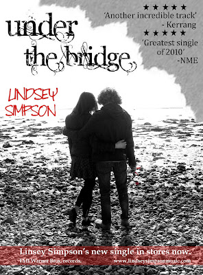
My Magazine advert
For my second ancillary I chose to produce an advertisement for the release of my musicians single on CD.
1. I began c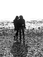 reating my advert by first opening adobe Photoshop 7.0
2. I opened my image and rotated the image to portrait so it would fit the standard A4 magazine page lines.
3. I then clicked the option ‘image adjustments’ under the image menu at the top of the screen and adjusted them accordingly so that the white and black tones where deeper and more defined.
4. I then saved this colour image before turning the photograph black and white using the black and white button under image, mode, greyscale.
5. I then opened both these images separately, and using the coloured photograph as a background I layered the black and white photograph directly over the top of it.
6. Zooming in to 200% and using a size 4-8 brush I rubbed out the outline of the black and white rose which revealed the red rose from the photograph underneath. I also erased the red ribbon of the rose.
7. After looking at a print out of my photo so far I realised the rose wasn’t visible enough so I cropped the photo using the cropping tool. Taking about a centimetre from each side and about three centimetres from the bottom, the image looks neater and more focused on the rose which is just off centre, I wanted the musician Lindsey to be central down the page to give it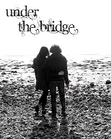 balance.
8. Then I wanted to add some text so I visited the website dafont.com. Here you can select a wide range of different fonts for many purposes. After trying a few I found a well suited one, which was distorted version of a curly classy font. It suits perfect because the song itself is soft but with a rough story under it. Also the RHCP usually have hand drawn or scrawley/ scribbled and unusual texts on their cover.
9. After saving my text I inserted it onto Photoshop and positioned it across the top of the page, just off centre to fill in the top left space and to balance the page out.
10. I then wanted to add something to the top right of the corner of the page, and just simply adding text wouldn't look very creative or attractive so I used technique which I used before. I ripped a few pieces of paper and chose one which had a good edge. I then scanned it onto my computer and opened it into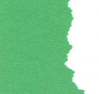 photoshop. I then rotated it, cropped it, and fitted it into the corner of the page. I then changed the colour of the of the green paper to grey. This is so it contrasts with the rest of the page and so I can put dark coloured text on top of it. I used this effect so the page looks more interesting. It also looks like the original photo has been ripped to reveal the text beneath.
 reating my advert by first opening adobe Photoshop 7.0
2. I opened my image and rotated the image to portrait so it would fit the standard A4 magazine page lines.
3. I then clicked the option ‘image adjustments’ under the image menu at the top of the screen and adjusted them accordingly so that the white and black tones where deeper and more defined.
4. I then saved this colour image before turning the photograph black and white using the black and white button under image, mode, greyscale.
5. I then opened both these images separately, and using the coloured photograph as a background I layered the black and white photograph directly over the top of it.
6. Zooming in to 200% and using a size 4-8 brush I rubbed out the outline of the black and white rose which revealed the red rose from the photograph underneath. I also erased the red ribbon of the rose.
7. After looking at a print out of my photo so far I realised the rose wasn’t visible enough so I cropped the photo using the cropping tool. Taking about a centimetre from each side and about three centimetres from the bottom, the image looks neater and more focused on the rose which is just off centre, I wanted the musician Lindsey to be central down the page to give it
 balance.
8. Then I wanted to add some text so I visited the website dafont.com. Here you can select a wide range of different fonts for many purposes. After trying a few I found a well suited one, which was distorted version of a curly classy font. It suits perfect because the song itself is soft but with a rough story under it. Also the RHCP usually have hand drawn or scrawley/ scribbled and unusual texts on their cover.
9. After saving my text I inserted it onto Photoshop and positioned it across the top of the page, just off centre to fill in the top left space and to balance the page out.
10. I then wanted to add something to the top right of the corner of the page, and just simply adding text wouldn't look very creative or attractive so I used technique which I used before. I ripped a few pieces of paper and chose one which had a good edge. I then scanned it onto my computer and opened it into
 photoshop. I then rotated it, cropped it, and fitted it into the corner of the page. I then changed the colour of the of the green paper to grey. This is so it contrasts with the rest of the page and so I can put dark coloured text on top of it. I used this effect so the page looks more interesting. It also looks like the original photo has been ripped to reveal the text beneath.
11. I then needed to write the artists name, as this is conventional for magazine adverts of this type. I again chose a hand written style of front from dafont.com. The RHCP use the same styled font on one of their albums, so I thought it was important to incorporate with my advert. They also had a red coloured text, and I have followed this theme through, so I took a swab from the rose on the photo and coloured my text the same colour. I positioned it level with the actor's heads to the left and just above the horizon of the water in the photo. This will link the text to the rose and to the bottom of the page when I add the text at the bottom.
 the horizon of the water in the photo. This will link the text to the rose and to the bottom of the page when I add the text at the bottom.
12. Next I decided to write the reviews for the single, which again are conventional aspects of magazine adverts, advertising music. I used Microsoft word to draw the star shape and filled it in black, copied and saved it into paint, then opened it into Photoshop. I then duplicated the layer 10 times and arranged them in the space in the top right corner. I then added the fake reviews. I was influenced for the reviews from previous reviews from NME and Kerrang magazine. I chose these two magazines because they are known for promoting rock/punk/pop musicians such as the RHCP, therefore it was appropriate for my musician.
13. The final steps of my advert where adding text to the bottom of the page. After doing my research I  discovered it was conventional to have related text at the bottom of the adverts. This information should include information on the release, the record company, and the musician's names and website. So I have included this information on the bottom of my advert. I again took a swab of the red text and used the shape tool to create a box for my text. I stretched it across the bottom of the page, leaving a small section at the bottom because I didn't want to much attention drawn to it. I also reduced the opacity to 50% so the pebbles where still visible through the box.
 discovered it was conventional to have related text at the bottom of the adverts. This information should include information on the release, the record company, and the musician's names and website. So I have included this information on the bottom of my advert. I again took a swab of the red text and used the shape tool to create a box for my text. I stretched it across the bottom of the page, leaving a small section at the bottom because I didn't want to much attention drawn to it. I also reduced the opacity to 50% so the pebbles where still visible through the box.
 14. The text in the box is white so it is visible on top of the red box and also it relates to the rest of the page because it has lots of white. The excessive use of black and white in my advert is also reflecting my music video which features the use of black and white filming, to represent the past/ memories.
Here is my finished product:
Research for Magazine adverts for the release of a new album
The second ancillary text I chose to produce was the magazine advert seeing as i had knowledge of magazine conventions from lats years course and I thought it would contrast well with my digi pack. As I have already created the digipack I decided to use similar resource materials so the texts convey a certain image and link towards each other.


From simply analysing these three ad's I have already picked up on some key conventions.
But first I am going to analyse some existing materials and then sketch up my own ideas.
Fig 1. Advert for the new Mika album. The colours and imagery reflect the style and the pop/rock genre of Mika. The artwork has taken clear imagery refrences from the pop art of the 50's and 60's because of the flare of bright colours and surreal imagery. So it is important the advert reflects the genre of music and the musicians. It is also important that the ad includs information about when/ where the album is released.
Fig 2. Is a magazine advert for alternative rock band The Stone Roses. The band are known for being an 80's & 90's English rock band, this is reflected through the colours of the Union Jack, red white and blue. This ad also contains reviews of the band, '10/10' and '5star ratings' from famous magazines such as NME, suggest to the audience that their new 'Greatest British Album Of All Time' is top quality and should be bought.
Fig 3. Is an ad for 'Queen of pop/rock' Gwen Stefani's new album. This ad is made of a photograph of Gwen which has been edited and had a photograhic effect layerd ontop of it. This makes her look more surreal, but her white blonde hair and red lipstick are still visible which will attract the audience as these are her assests for which she is know for. The rich gold colour and pearly white's add to the richness of the shot, making Gwen appear Queen-like. Also because she is baring a crow and staff it adds to the queen effect.
From simply analysing these three ad's I have already picked up on some key conventions.
- To include a visual image of the artist/ group
- To have the artists name/ groups name visible/ make it stand out on the page.
- To include information about the release of the album/single.
- To include a review/ something to grab the audiences attention.
My Digi-pack
Above are the images from a photoshoot I did for possible use for my digi pack or advertiement.
From these images I selected my favorite ones.
I started off by creating the back of the CD case.
 I selected this image, uploaded it into photoshop and cropped it to the correct dimentions, making sure the image was central.
I then changed the levels of the image, unders adjustments. This gave a different and more edgy tone to the photo rather than just a romantic embrace between two people.
I then chose a sturdy easy to read font and printed it severl times accross the top of the back cover. This is the list for the tracks.
I also duplicated and layered the image a few times to get a shakey effect. This again gives the back cover an edge rat
 her than just text and images.
Before the back page was complete I had to add the key conventions which are found on the back of any album cover. These are: a bar code, a price tag, producer, record company.


Wednesday, 5 May 2010
CD digi-pack analysis
All in all I need to create two ancillary texts. For one of the ancillary texts I am going to create a cover for the case my music video would be marketed in. To do this it is important that I analyse various album covers of different artists that would interest my target audience to ensure that I have enough ideas and knowledge for my own product to look attractive and eye-catching but to also appeal to my target audience.
Analysis of front covers:
Fig 1. To the left is the actual album cover for Maroon 5's album Songs About Jane which I have taken the song 'She will be Loved'.
The cover is built up of illustrations and text. As the colours red and black are used, they act as signifies. Red is a code for love, romance, passion and danger. Contrasting with the black which is emptiness or darkness. The illustration of the female on the cover both sexual and beautiful.

Fig 2. The album cover to the right is the cover for one of Prodigy's albums "The fat of the Land". Prodigy are well know for their up beat, surreal music and therefore the image of this spaced out looking crab reflects their image well. Also because of the way the image has been manipulated to appear like who ever is looking at the crab is dizzy - maybe from all the drugs and alcohol consumed at a prodigy gig and they may be hallucinating.

Fig 3. To the left is the album cover for Pink Floyd's album "Dark side of the moon". The artist has simply taken the already established image of the dispersive prism whereby a Triangular prism is used to disperse light, that is to break light up into its spectral components (the colors of the rainbow).
The Title "Dark side of the moon" is reflected through the imagery, as the left side of the triangle could be acting like the dark side and the rainbow on the right is the light side.

Analysis of front covers:
Fig 1. To the left is the actual album cover for Maroon 5's album Songs About Jane which I have taken the song 'She will be Loved'.
The cover is built up of illustrations and text. As the colours red and black are used, they act as signifies. Red is a code for love, romance, passion and danger. Contrasting with the black which is emptiness or darkness. The illustration of the female on the cover both sexual and beautiful.
Fig 2. The album cover to the right is the cover for one of Prodigy's albums "The fat of the Land". Prodigy are well know for their up beat, surreal music and therefore the image of this spaced out looking crab reflects their image well. Also because of the way the image has been manipulated to appear like who ever is looking at the crab is dizzy - maybe from all the drugs and alcohol consumed at a prodigy gig and they may be hallucinating.
Fig 3. To the left is the album cover for Pink Floyd's album "Dark side of the moon". The artist has simply taken the already established image of the dispersive prism whereby a Triangular prism is used to disperse light, that is to break light up into its spectral components (the colors of the rainbow).
The Title "Dark side of the moon" is reflected through the imagery, as the left side of the triangle could be acting like the dark side and the rainbow on the right is the light side.
Subscribe to:
Comments (Atom)