1. I began c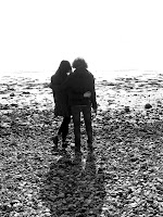 reating my advert by first opening adobe Photoshop 7.0
2. I opened my image and rotated the image to portrait so it would fit the standard A4 magazine page lines.
3. I then clicked the option ‘image adjustments’ under the image menu at the top of the screen and adjusted them accordingly so that the white and black tones where deeper and more defined.
4. I then saved this colour image before turning the photograph black and white using the black and white button under image, mode, greyscale.
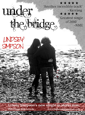
5. I then opened both these images separately, and using the coloured photograph as a background I layered the black and white photograph directly over the top of it.
6. Zooming in to 200% and using a size 4-8 brush I rubbed out the outline of the black and white rose which revealed the red rose from the photograph underneath. I also erased the red ribbon of the rose.
7. After looking at a print out of my photo so far I realised the rose wasn’t visible enough so I cropped the photo using the cropping tool. Taking about a centimetre from each side and about three centimetres from the bottom, the image looks neater and more focused on the rose which is just off centre, I wanted the musician Lindsey to be central down the page to give it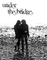 balance.
8. Then I wanted to add some text so I visited the website dafont.com. Here you can select a wide range of different fonts for many purposes. After trying a few I found a well suited one, which was distorted version of a curly classy font. It suits perfect because the song itself is soft but with a rough story under it. Also the RHCP usually have hand drawn or scrawley/ scribbled and unusual texts on their cover.
9. After saving my text I inserted it onto Photoshop and positioned it across the top of the page, just off centre to fill in the top left space and to balance the page out.
10. I then wanted to add something to the top right of the corner of the page, and just simply adding text wouldn't look very creative or attractive so I used technique which I used before. I ripped a few pieces of paper and chose one which had a good edge. I then scanned it onto my computer and opened it into photoshop. I then rotated it, cropped it, and fitted it into the corner of the page. I then changed the colour of the of the green paper to grey. This is so it contrasts with the rest of the page and so I can put dark coloured text on top of it. I used this effect so the page looks more interesting. It also looks like the original photo has been ripped to reveal the text beneath.
 reating my advert by first opening adobe Photoshop 7.0
2. I opened my image and rotated the image to portrait so it would fit the standard A4 magazine page lines.
3. I then clicked the option ‘image adjustments’ under the image menu at the top of the screen and adjusted them accordingly so that the white and black tones where deeper and more defined.
4. I then saved this colour image before turning the photograph black and white using the black and white button under image, mode, greyscale.
5. I then opened both these images separately, and using the coloured photograph as a background I layered the black and white photograph directly over the top of it.
6. Zooming in to 200% and using a size 4-8 brush I rubbed out the outline of the black and white rose which revealed the red rose from the photograph underneath. I also erased the red ribbon of the rose.
7. After looking at a print out of my photo so far I realised the rose wasn’t visible enough so I cropped the photo using the cropping tool. Taking about a centimetre from each side and about three centimetres from the bottom, the image looks neater and more focused on the rose which is just off centre, I wanted the musician Lindsey to be central down the page to give it
 balance.
8. Then I wanted to add some text so I visited the website dafont.com. Here you can select a wide range of different fonts for many purposes. After trying a few I found a well suited one, which was distorted version of a curly classy font. It suits perfect because the song itself is soft but with a rough story under it. Also the RHCP usually have hand drawn or scrawley/ scribbled and unusual texts on their cover.
9. After saving my text I inserted it onto Photoshop and positioned it across the top of the page, just off centre to fill in the top left space and to balance the page out.
10. I then wanted to add something to the top right of the corner of the page, and just simply adding text wouldn't look very creative or attractive so I used technique which I used before. I ripped a few pieces of paper and chose one which had a good edge. I then scanned it onto my computer and opened it into
 photoshop. I then rotated it, cropped it, and fitted it into the corner of the page. I then changed the colour of the of the green paper to grey. This is so it contrasts with the rest of the page and so I can put dark coloured text on top of it. I used this effect so the page looks more interesting. It also looks like the original photo has been ripped to reveal the text beneath.
11. I then needed to write the artists name, as this is conventional for magazine adverts of this type. I again chose a hand written style of front from dafont.com. The RHCP use the same styled font on one of their albums, so I thought it was important to incorporate with my advert. They also had a red coloured text, and I have followed this theme through, so I took a swab from the rose on the photo and coloured my text the same colour. I positioned it level with the actor's heads to the left and just above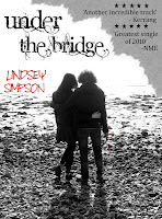 the horizon of the water in the photo. This will link the text to the rose and to the bottom of the page when I add the text at the bottom.
 the horizon of the water in the photo. This will link the text to the rose and to the bottom of the page when I add the text at the bottom.
12. Next I decided to write the reviews for the single, which again are conventional aspects of magazine adverts, advertising music. I used Microsoft word to draw the star shape and filled it in black, copied and saved it into paint, then opened it into Photoshop. I then duplicated the layer 10 times and arranged them in the space in the top right corner. I then added the fake reviews. I was influenced for the reviews from previous reviews from NME and Kerrang magazine. I chose these two magazines because they are known for promoting rock/punk/pop musicians such as the RHCP, therefore it was appropriate for my musician.
13. The final steps of my advert where adding text to the bottom of the page. After doing my research I 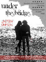 discovered it was conventional to have related text at the bottom of the adverts. This information should include information on the release, the record company, and the musician's names and website. So I have included this information on the bottom of my advert. I again took a swab of the red text and used the shape tool to create a box for my text. I stretched it across the bottom of the page, leaving a small section at the bottom because I didn't want to much attention drawn to it. I also reduced the opacity to 50% so the pebbles where still visible through the box.
 discovered it was conventional to have related text at the bottom of the adverts. This information should include information on the release, the record company, and the musician's names and website. So I have included this information on the bottom of my advert. I again took a swab of the red text and used the shape tool to create a box for my text. I stretched it across the bottom of the page, leaving a small section at the bottom because I didn't want to much attention drawn to it. I also reduced the opacity to 50% so the pebbles where still visible through the box.
 14. The text in the box is white so it is visible on top of the red box and also it relates to the rest of the page because it has lots of white. The excessive use of black and white in my advert is also reflecting my music video which features the use of black and white filming, to represent the past/ memories.
Here is my finished product:

No comments:
Post a Comment